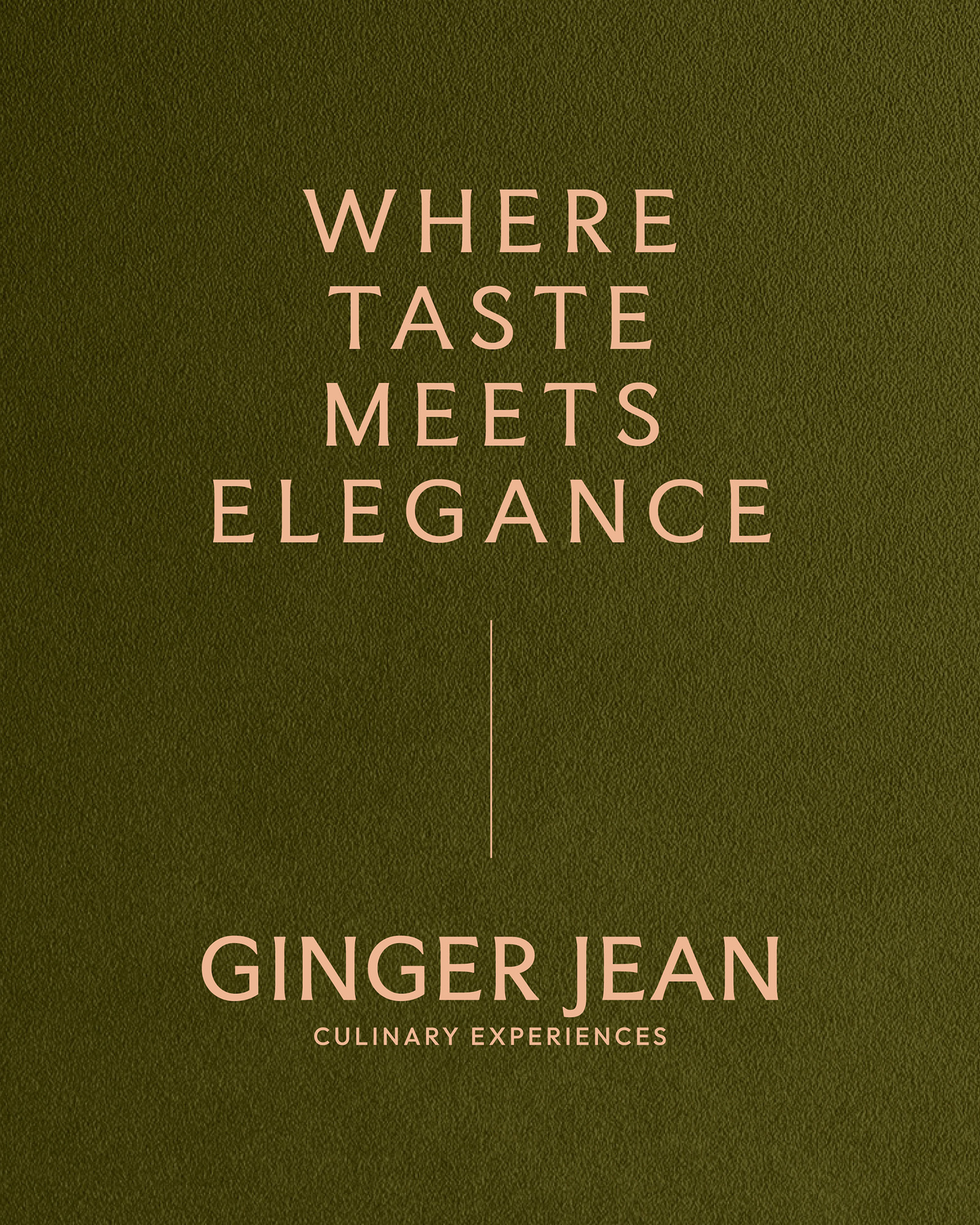
The Ginger Jean rebrand was centered around one key concept; heritage. To celebrate their ten year anniversary, we were tasked with honoring the tradition and heritage at the heart of the brand with a rebranded identity that will carry them through the next decade and beyond.
brand identity design
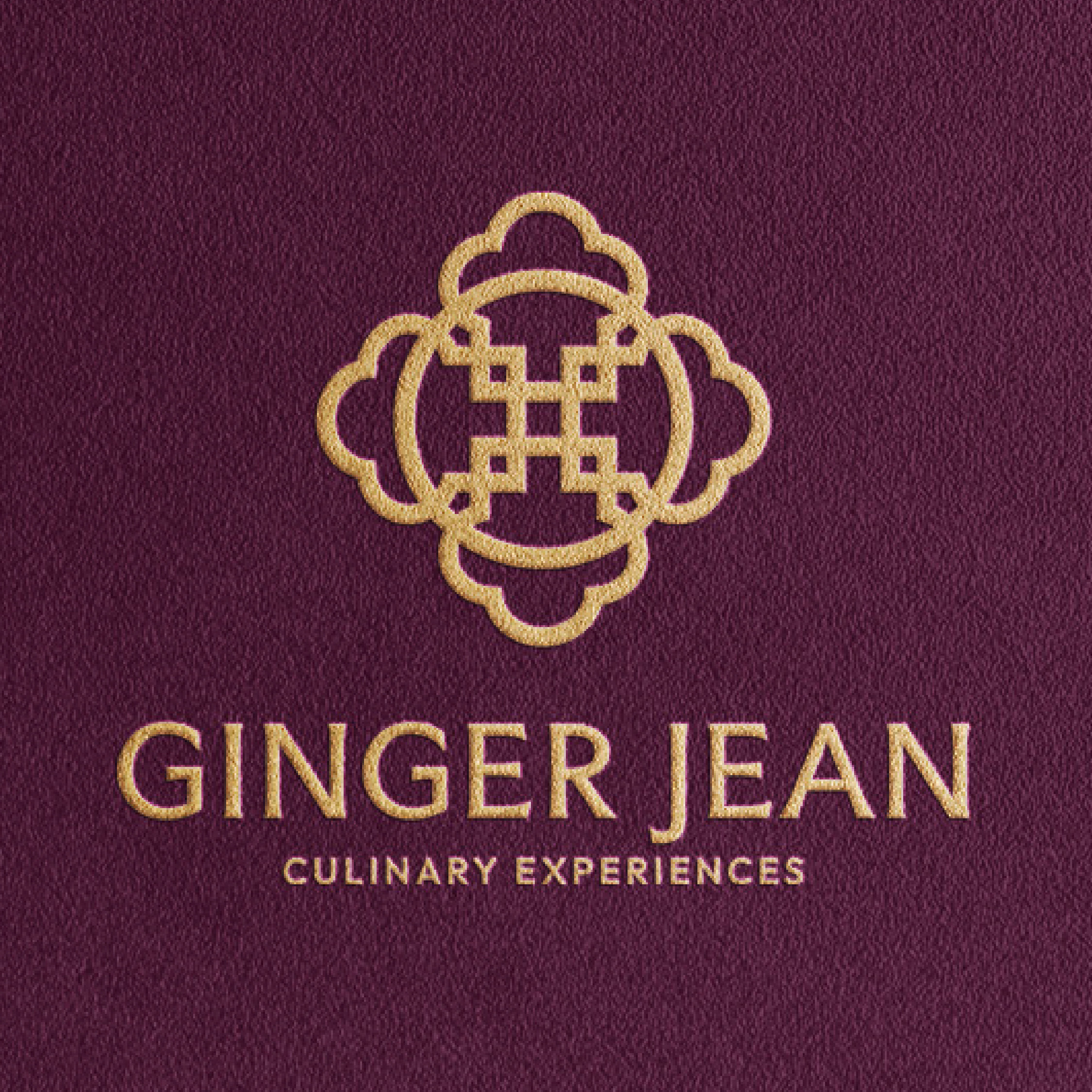
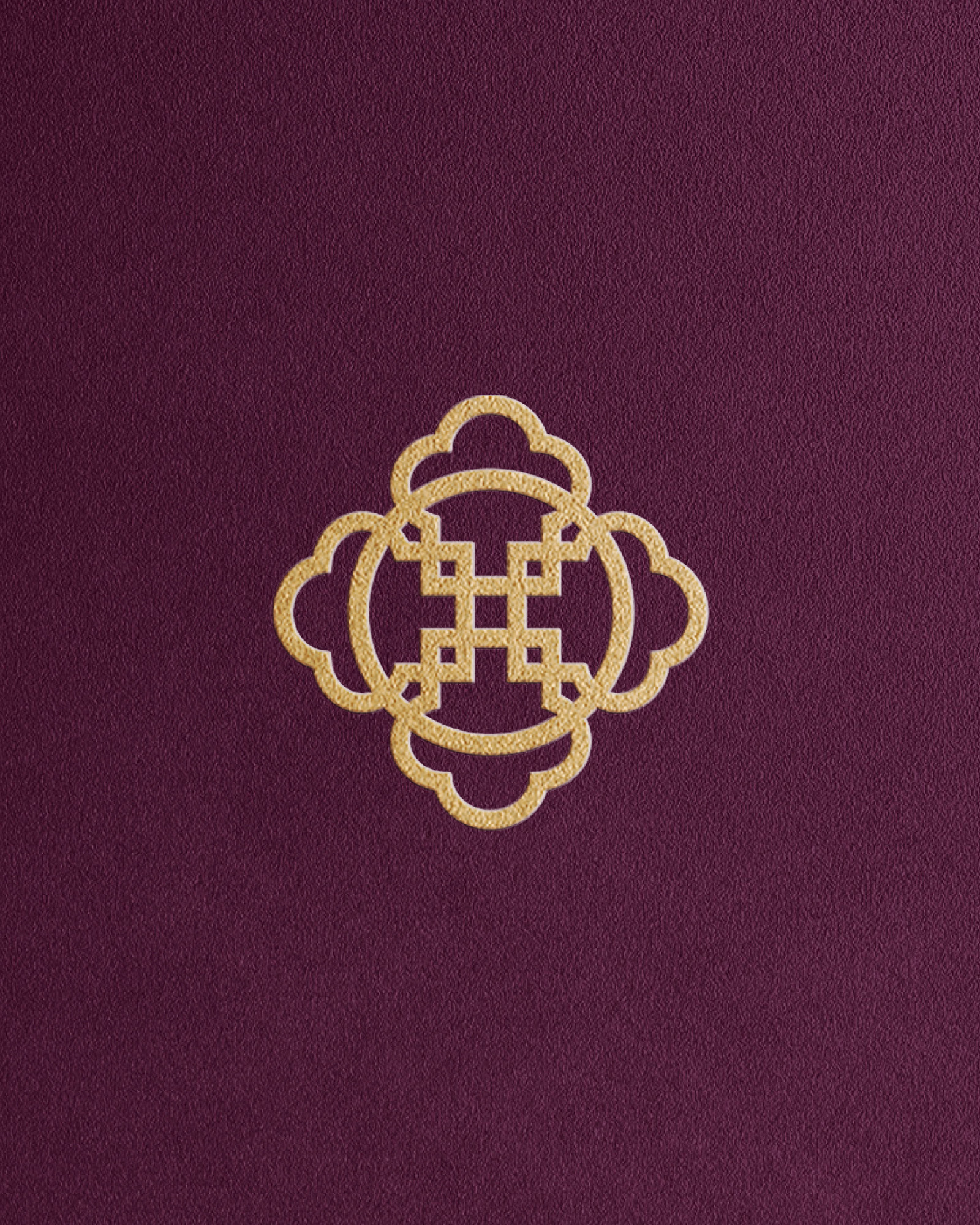
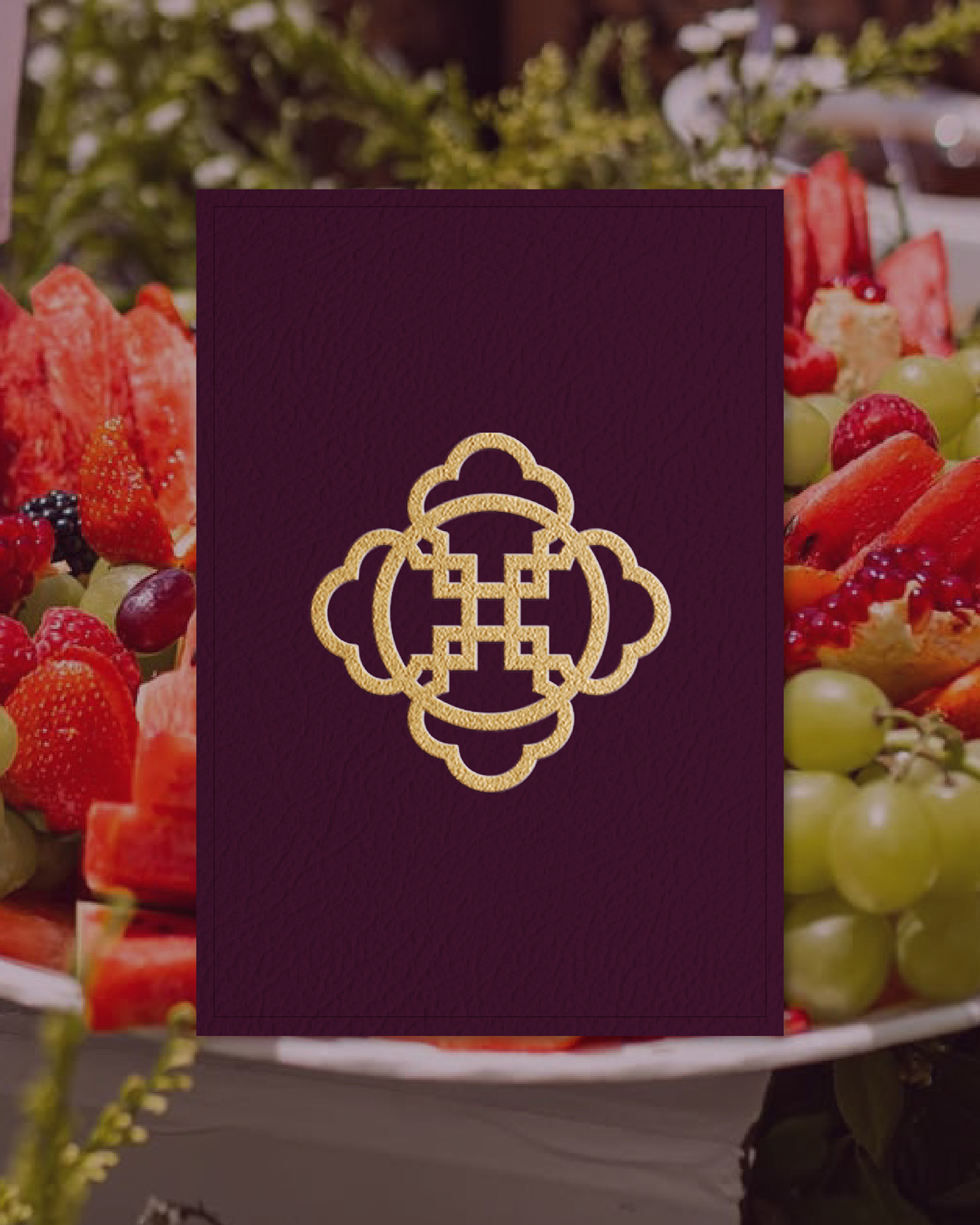
The chef’s hat, an overlooked element of their old logo, became the star of their new identity. Four chef hats are rotated, duplicated, and merged to create a symbol of unity, excellence and creativity. The center of the brand mark is reminiscent of the Adinkra symbol Nsaa, a symbol of excellence and authenticity.
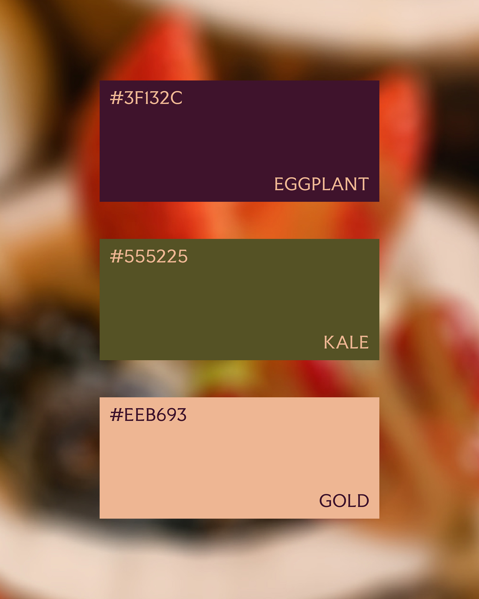
The color palette of rich purple, olive green and rose gold were selected to represent luxury and royalty. The typography is classic and bold, with a hint of African excellence.
The new Ginger Jean logo is elevated yet still authentic to the history and spirit of the brand, resulting in a brand that is as polished as the culinary experiences they deliver.