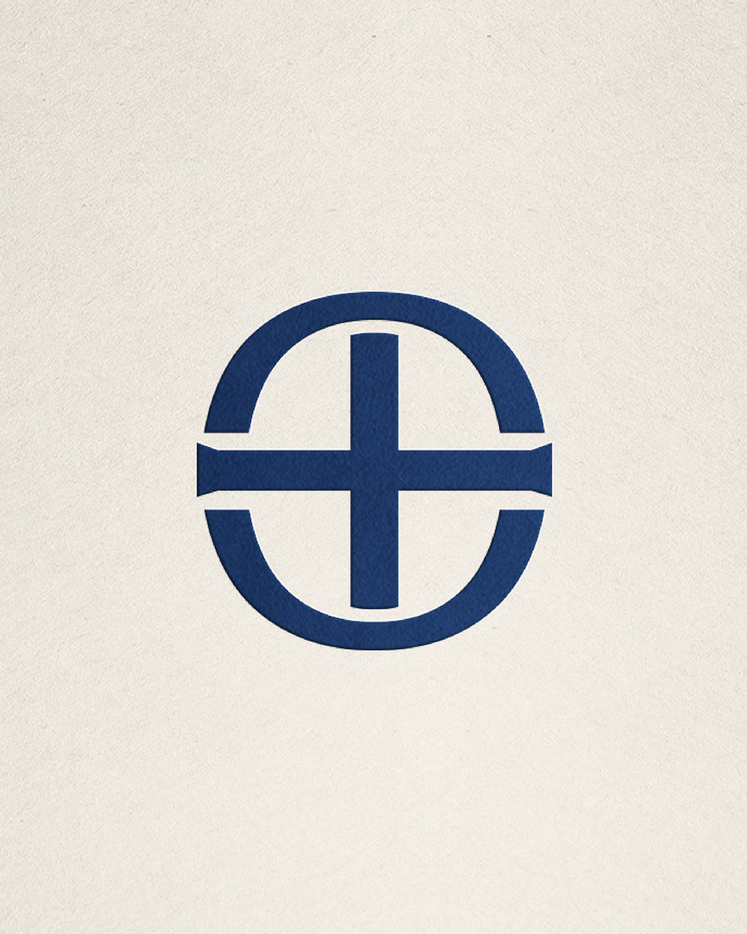
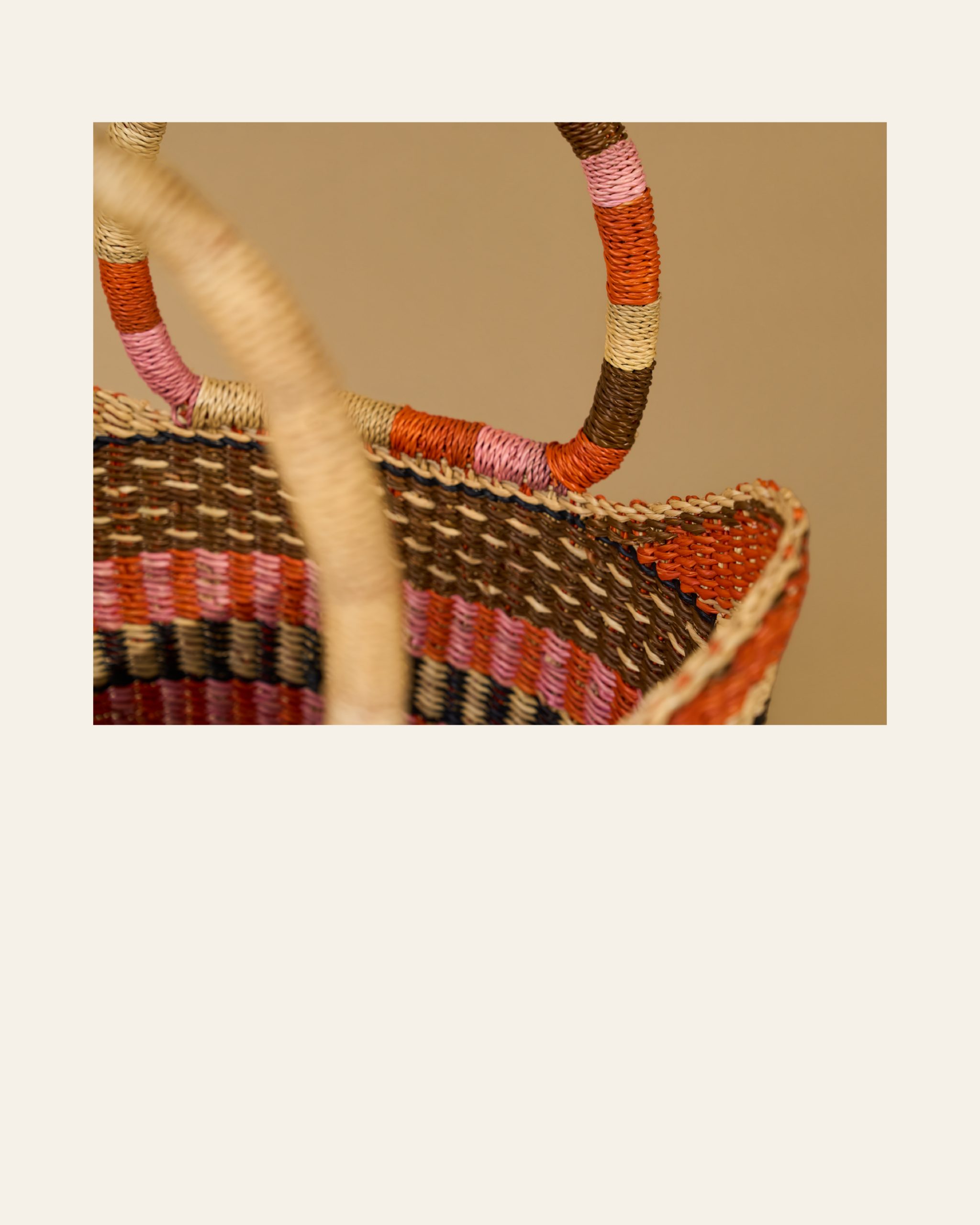
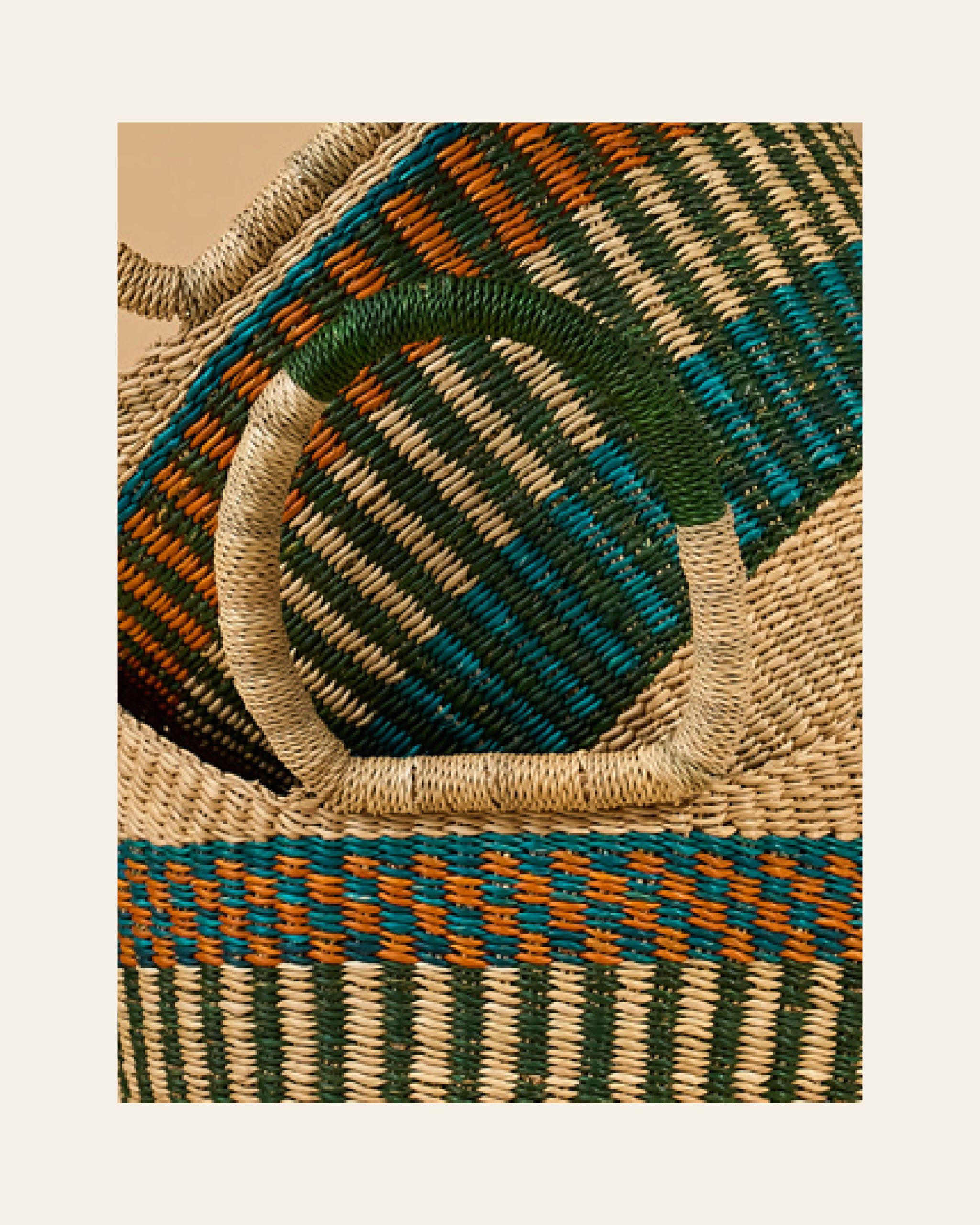
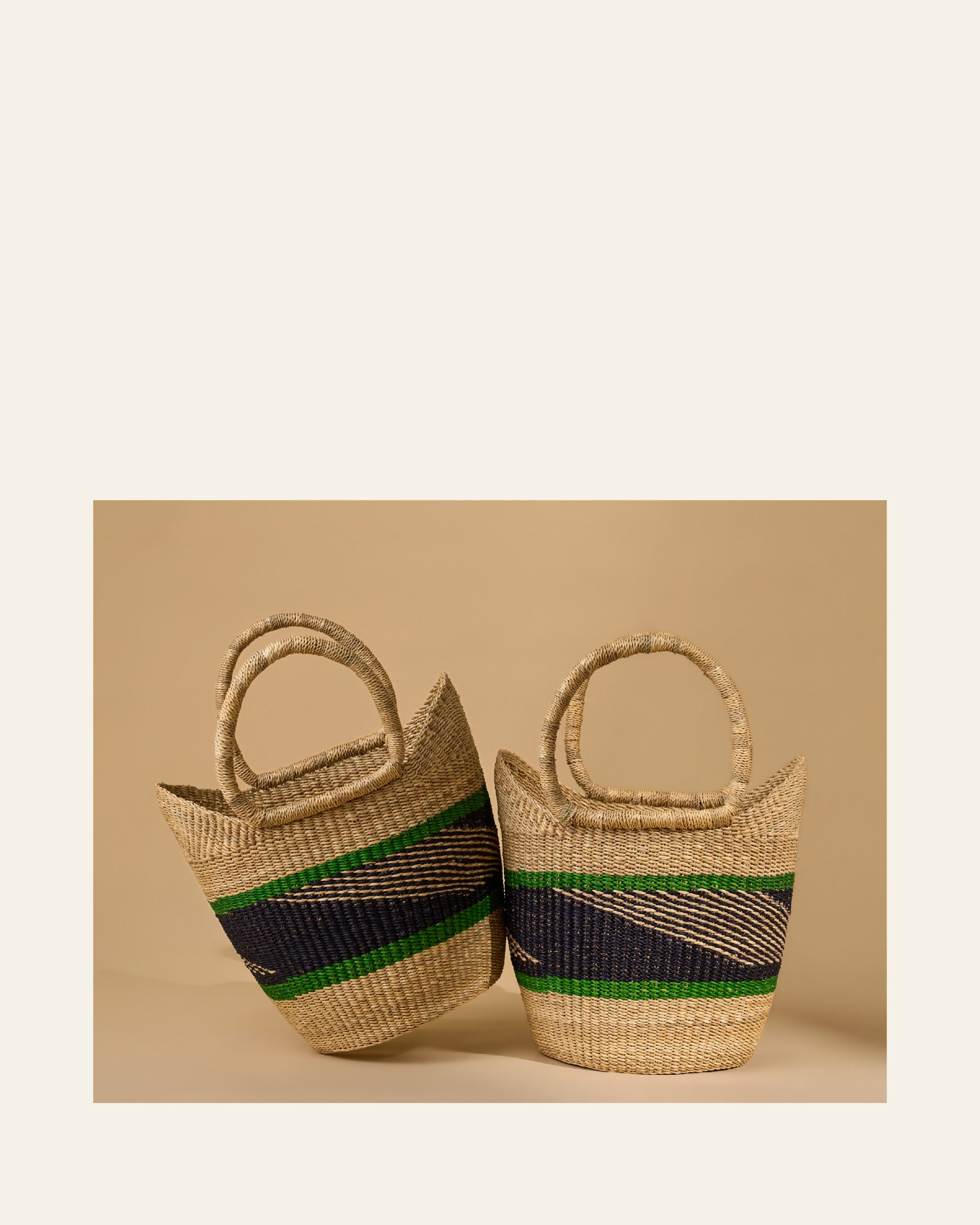
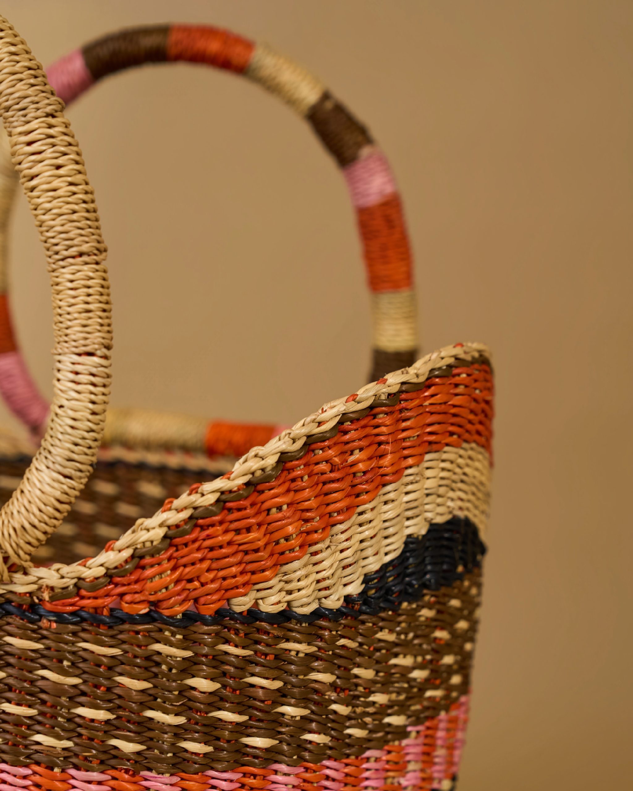
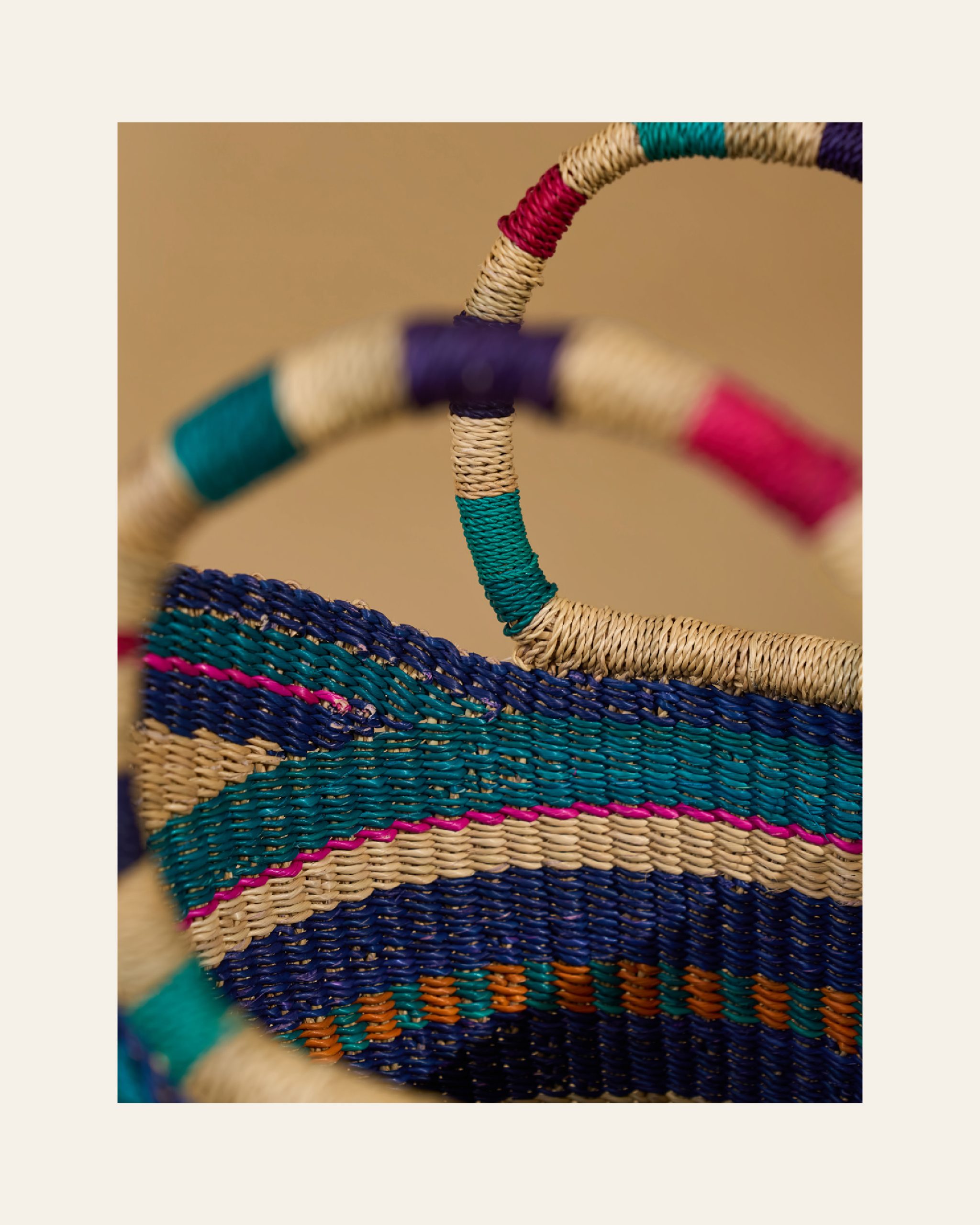
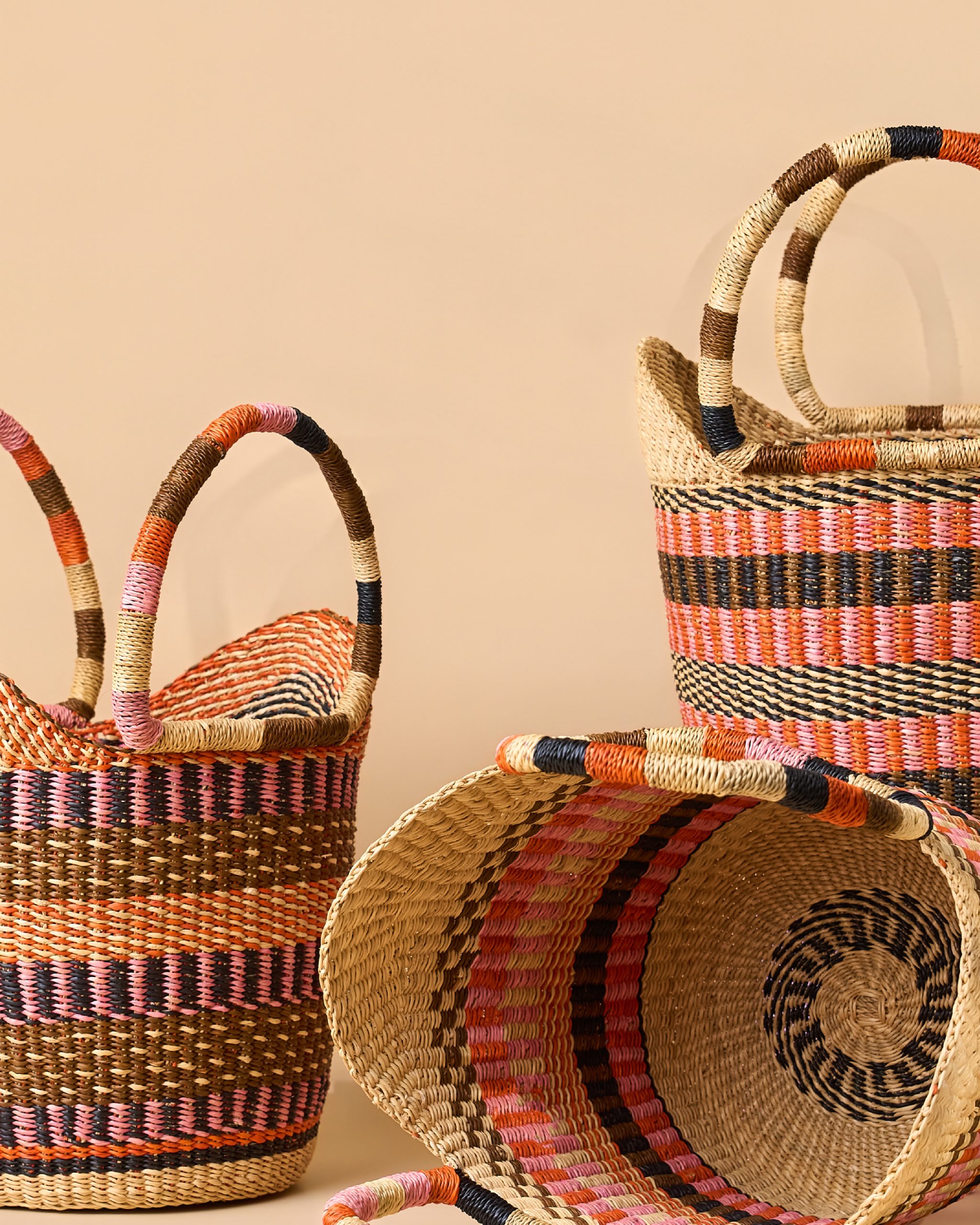
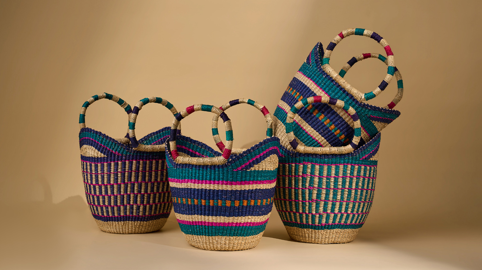
Clean lines, simple typography, and expressive editorial imagery take center stage, while the rest of the identity is stripped down to the essentials. The brand monogram, inspired by basket weaving, grounds the brand in its heritage while giving it a distinctive, recognisable mark.
From the art direction of the brand imagery to the editorial e-commerce website, every detail was carefully considered to create a cohesive brand experience. Nothing is there just for the sake of it; every element has a role to play in how the brand looks, feels, and connects with its audience.
In OGOE, story, structure, and form all come together in one quietly confident package.