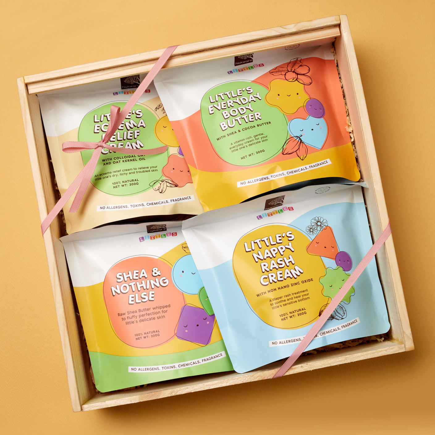
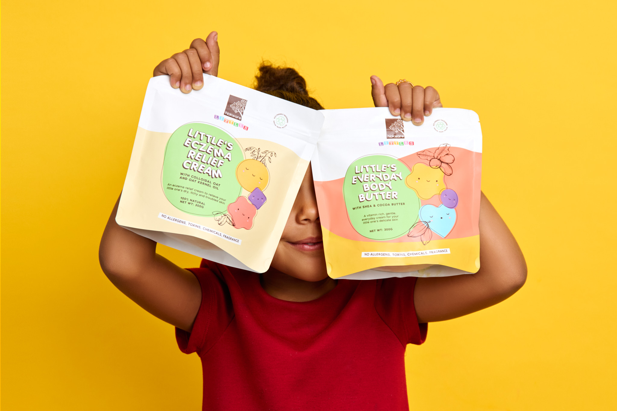
This project combined a few of our favourite things; custom illustrations, bright colors, and an amaaazing product! We welcomed Nokware Littles to the Nokware Skincare family with cute, sustainable, and functional packaging design.
Because babies and toddlers deserve good skin too!

Our goal was to create packaging for this line that reflected the Nokware spirit and maintained the sophistication the brand is known for, while also resonating directly with parents and their littles with a more playful and approachable feel.
The resulting designs are fun, charistmatic, and iconic.
Bright colors, illustrations and fun fonts combine to create a truly unique pouch. Each product variant features its own unique characters–stars, hearts, circles, and other primary shapes–alongside illustrations of key ingredients.
Customers–parents and children alike–reacted extremely positively to the packaging design. The colors, attractive design, and overall aesthetics kept them coming back for more!

