As an emerging engineering and subsea services company, OceanLift Subsea needed a look that was modern, professional, and reflected their expertise. Our goal was to create a brand that stands out while keeping their industry credibility front and center.
visual identity design, website design
The typography-based logo encapsulates the brand’s key characteristics in a very clean and timeless manner. The company name is written in a minimal geometric font, bold without being too heavy, and light without appearing too delicate. The slightly rounded edges balance the structural construction of the letterforms, and there are some unique touches such as the join of the “EA” and the “FT” that keep it from being boring.
Hidden subtly in the “EA” is an upwards arrow, signifying not only growth, leadership and achievement in a symbolic sense, but also serving as a representation of the word “lift” in the brand name.
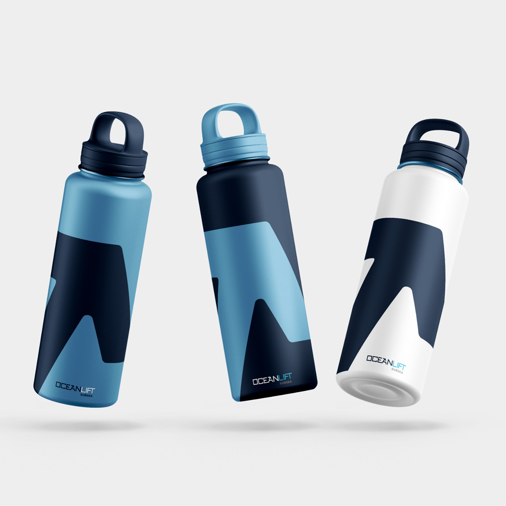
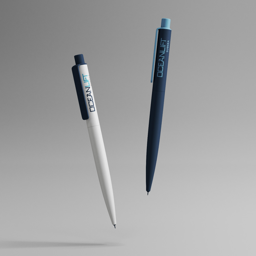
The color palette features a pairing of a rich navy and cool sky blue that evokes trust, innovation, and a connection to the sea.
We delivered templates and materials for presentations, business cards, and more, ensuring their brand is cohesive across every touchpoint.
We also built a polished, user-friendly site to showcase their services, expertise, and projects. From clear navigation to engaging visuals, it pairs perfectly with their brand identity to make a bold, strong and engaging impact. They now have a platform that reflects their expertise and helps them connect with clients in a clear and confident way.


